This is a blog post based on a Google+ post about a tweet. I can only hope that it will inspire a further flourishing of vines, instagrams and Yo!-s.
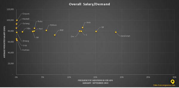
I saw this graph (originally from job stats site msgooroo.com) posted by a functional programming news site:
“More reasons to choice Functional Programming – #Clojure and #Haskell highest paying #engineer salaries!”.
Well, should I “choice” Haskell or Clojure, based on the evidence in this graph?
The first thing to notice is that Haskell and Clojure are almost never mentioned in job ads. That means that if everyone became a specialist in Clojure due to it paying the most, each individual would have a very low likelihood of actually getting a Clojure job because of all the competition.
Almost all of the other languages are fairly close to the \$80,000 mark, so it might make sense to learn JavaScript: since there are plenty of jobs to go around, you can trade a slight decrease in potential earnings for a higher likelihood of getting a job. After all, you want to maximise your expected salary, and
\[ \mathrm{E}[salary] = \int_{jobs} wage(job) \cdot \Pr(\text{hired for } job) \, \mathrm{d}job \]
But you might not even have to make that compromise! The vertical axis on this graph is average salary. There could well be a decent amount of variance in salaries for JavaScript jobs, meaning that there could be more JavaScript jobs paying higher than even the best-paid Clojure job.
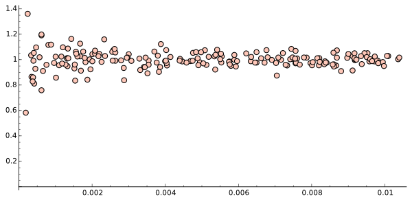
But then I had another thought: the shape of the data looks pretty suspicious. The extreme points are on the left, where the numbers of adverts are smaller, and the points get less spread out towards the right.
I decided to do some investigation in my new favourite toy, The SageMath Cloud. I set up a worksheet which generates a few samples from the same Gaussian distribution, of different sizes, and does the same plot as the one above: the horizontal axis is sample size, and the vertical is sample mean.

It’s the same shape!
So the apparently high mean wage for Clojure jobs might just be a result of statistical noise, and the more middling mean wage for JavaScript is the central limit theorem in action!
(By the way, here’s my working-out)
In conclusion, this graph could do with being a box-and-whisker plot, and those poor few souls coding in FORTRAN need to ask for a pay rise.
And all along, we’ve assumed programming languages are fungible. I think that’s only true for Befunge.
