This is just about the most right-on, 21st-century paper and associated PR I’ve seen this year. MIT’s SENSEable City Lab has produced this little video to go with a paper by some of their researchers, led by Carlo Ratti:
[youtube url=http://www.youtube.com/watch?v=e-hlP8Ql384]
So we have a slickly produced YouTube video announcing an open-access paper about big data with a trendy creative commons 8-bit music track behind it. I don’t know whether to applaud them on a job well done or to have an adverse reaction against that much political correctness and PR budget in one place.
The paper is published on PLoS ONE. They pose the question “Do regional boundaries defined by governments respect the more natural ways that people interact across space?” and use BT’s database of who has called whom to come up with a new partitioning of the country.
Weirdly, most of the information about their method is contained in Word documents attached to the paper, which makes it hard to read the whole thing. Additionally frustratingly, the maths notation doesn’t even use Word’s equation editor – it’s grainy pasted-in images. Does PLoS ONE require this weird way of presenting research? Twelve future-science points deducted.
It seems they reduced Great Britain down to a grid of “3,042 pixels”, and computed a matrix of the strength of connections between pixels based on the total time spent in phone calls between them. They then applied “[Newman’s] spectral optimization algorithm” to maximise the modularity of their partitioning of the space, which looks like a measure of how often strongly linked nodes are in the same part of the partitioning, weighted by the strength of the connection. (The “definition of modularity” attachment doesn’t give a plain English explanation of what it represents, so I had to guess) Update: during a brief Twitter conversation with Steven Strogatz, one of the authors, he pointed me to the wikipedia article about modularity. I think “measures how self-contained divisions are” is a decent, brief definition – nodes in the same division should have strong links between each other, but weak links to nodes on the outside.
They provide some evidence that their partitioning is pretty stable with respect to changes in the data, by looking at subsamples, and compare a variety of partitioning algorithms. The results contain a few interesting factoids: the partition doesn’t overlap particularly well with the distribution of English dialects, which you might have expected, and the secession of Wales from the UK would cause much more inconvenience than the secession of Scotland, which sounds right to me.
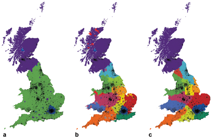
Increasingly refined partitionings of Great Britain. © 2010 Ratti et al, distributed under the terms of the Creative Commons Attribution licence.
Paper: Redrawing the Map of Great Britain from a Network of Human Interactions in PLoS ONE
By the way, the song in the video is Sad Robot by Pornophonique.
These maps are based on call patterns between landlines, right? So it’s largely a map of interactions between businesses/old people?
Also it occurs to me that the data corresponding well to existing administrative divisions might in part be due to the fact that phone calls between places with different area codes cost more and so might be less frequent merely due to market forces.