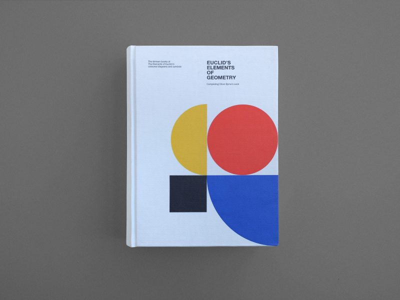
Barcelona-based publishing company Kronecker Wallis have produced a new updated edition of Byrne’s Euclid. We asked founder and editor Jordi Anton to tell us all about it – and their related Principia reprint, which is still looking for funding on Kickstarter.
Tell us about Euclid’s Elements.
Euclid of Alexandria lived c. 300 BCE. He wrote The Elements, the most widely used mathematics and geometry textbook in history. The Elements consists of thirteen books. In all, it contains 465 theorems and proofs, described in a clear, logical and elegant style, and using only a compass and a straight edge. Euclid’s Elements has influenced all branches of science but none so much as mathematics and the exact sciences. No other book except the Bible has been so widely translated and circulated.
The first printed version of the Elements appeared in 1482 with the advent of the printing press. It was based on Campanus of Novara’s 1260 edition. On May 25, 1482 printer Erhard Ratdolt of Venice issued the first printed edition of Euclid’s Elements. It was the first substantial book to contain geometrical figures. From definitions and axioms, Euclid showed how to prove dozens of mathematical propositions, producing knowledge that was objective and undeniable.
Isaac Newton’s famous work Principia Mathematica clearly demonstrates Euclid’s influence. Newton called his famous laws of motion “axioms” and deduced his law of gravitation in the form of two mathematical theorems.
Who was Oliver Byrne, and what did he do?
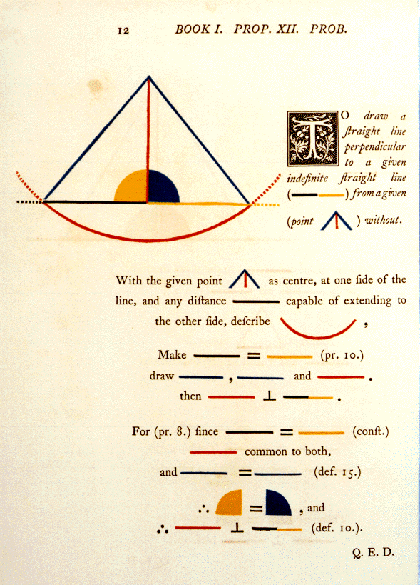
Irish-born Oliver Byrne (1810-1880) was an innovator in mathematics education, particularly in the teaching of geometry. His most well-known book was his colorful version of ‘Euclid’s Elements’, published in 1847. Oliver Byrne employed a red, yellow, and blue color scheme for the figures and diagrams in his most unusual 1847 edition of Euclid’s Elements.
“I do not introduce colours for the purpose of entertainment, or to amuse by certain combinations of tint and form, but to assist the mind in its researches after truth, to increase the facilities of instruction, and to diffuse permanent knowledge”.
Oliver Byrne
Byrne had experimented with colors in schools and he had evidently decided that the schoolteacher’s approach indicating lines, angles,… on the blackboard and then making deductions from them would be better described by his method than in the usual way.
Oliver Byrne’s 1847 Euclid was one of the first multicolor printed books. Many consider it the most attractive edition of Euclid’s Elements ever produced.Byrne’s Euclid was exhibited in London at the Great Exhibition of 1851. Praise was given for its beauty and the artistry of the printing, which may have influenced future publications and artwork.
You might have noticed we’re fans of Byrne’s diagrams here at the Aperiodical (see: our header images and branding). What drew you to Byrne’s work?
After printing Isaac Newton’s Principia, we were searching for another major book in science. We have been in love with Elements for a long time and as design enthusiasts, Byrne’s work held a special place in our minds. Those beautiful, minimalist, clean and didactical lines encouraged us to start a crazy adventure, to finish Byrne’s work. All 13 books.
It simply could not be unfinished!
What’s different between your edition and Byrne’s original?
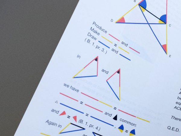
The first six books are identical. We only applied a modern vectorial design to graphs and a new typography, but the content is the same. Our hard work started when creating the visual interpretation of the rest of the books, from 7 to 13.
Who took on the challenge of reinterpreting Euclid’s work on books 7-13?
A team of 6 mathematicians worked almost a year and a half – thinking, drawing and writing every page of the books. The team not only have great mathematical skills, but also a deep knowledge of mathematics history and mathematics didactic.
Were there any challenges presented by content in the later books?
Absolutely. Almost all the later books were a challenge, especially the 10th. This book involved a very long journey for our mathematicians. Not only talking about maths – the entire project was a challenge because we needed to manage a large team of mathematicians, designers, editors… taking our small company nearly to its limits – it was hard and difficult to adapt a lot of non-geometrical propositions; lots of points-of-view, a lot of nights thinking how to solve a problem… but in the end we have achieved what we believe to be an outstanding end result.
How did you incorporate Byrne’s unique graphical style for the less visual content?
We were faithful to Byrne’s philosophy and before any designer started to work, we created a visual guide for internal use. With that guide, we worked together with mathematicians re-using graphical elements and creating some new ones – because books 7 – 13 needed a new color (some graphs needed more than Byrne’s three basic colors).But focusing on your question, for the less visual content, we followed Byrne’s color scheme and put it into the text as imaginary words.
What’s the target audience for your book? Why should we buy an expensive paper edition when free, interactive versions are available online?
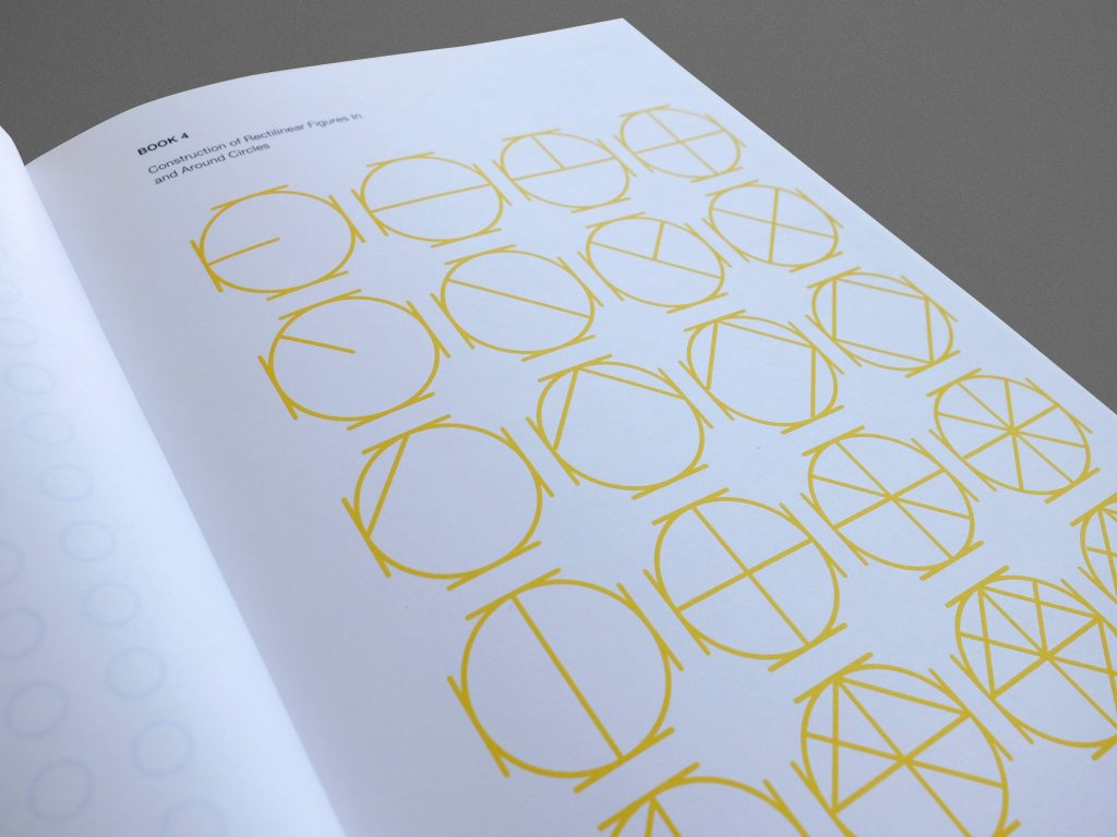
We are intrinsically ‘digital’ and know that physical books nowadays can seem hard to manage and expensive….thats the reason we print books with high quality papers and with a love for design. We try to keep an eye on the details and quality. We have a high respect for our customers and want to create books that meet their expectations (when they are committed to not relying on the free digital versions) – it’s our priority. Obviously, our Elements is an expensive book because it was very expensive to produce. Much more than our other books.
We smiled when we found out that Byrne’s Euclid was extremely difficult and expensive to produce. Only one thousand copies (almost like our crowdfunding campaign) were originally published. It was sold at a price of 25 shillings, almost five times the typical book price at the time. Maybe we are also close to that ‘five times the amount’ with our book – compared to a typical book.
Our audience are science lovers. A lot of our customers send us ideas of new books, authors,… and they are science people. But also they love well-produced books and buy them as collectors because our books are books to own, not only to read. We do not know how to, nor do we want to, create a monotonous and characterless product. We want to create books to own and create the desire to touch unique books made by lovers of books and science. Not only for customers.
What have you learned from this project?
Patience! We published it with a few delays because we prioritized quality and good content versus speed. That meant, people had to have a lot of patience with us waiting for their books without asking. We love our customers and supporters, they are the most important motivation for us.
Also, we learned how beautiful mathematics can be and the power of joining mathematics and design – to reach more people and understand math better.
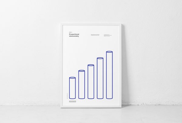
As well as the book itself, are there any related products people can pick up? (I’m thinking posters. I want a poster.)
Yes! Posters – we created a poster of every book cover. The cover design is our creation, Byrne didn’t create them. They are truly beautiful.
At the other hand, our Newton’s Principia could be also a related product. Newton used Euclid’s Elements knowledge and language to introduce his theorems. Since last Tuesday we are trying to reprint it again.
What’s your next project? Is it also maths-related?
Now we are only focused on a 6-book Astronomy collection. We did a Kickstarter campaign earlier this year, and we are working hard now on translations. Another challenge for us!
We don’t know which will be our next big project. I’ll keep you posted!
I just want to mention the online version created by Nicholas Rougeux at https://www.c82.net/euclid/ . Like the original edition, the online version only has the 6 books. Rougeux even designed posters and puzzles with the diagrams from Byrne’s edition.