In this series of posts, Katie investigates simple mathematical concepts using the Google Sheets spreadsheet app on her phone. If you have a simple maths trick, pattern or concept you’d like to see illustrated in this series, please get in touch.
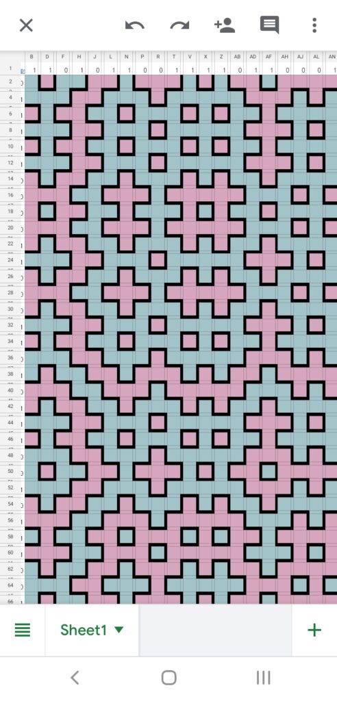
It’s been a while since we’ve had an entry in this column, but the other day I was sent a link to a very interesting spreadsheet (which I, of course, opened using the Google Sheets app on my phone). The initial view was a pleasing pattern of squares, in two colours:
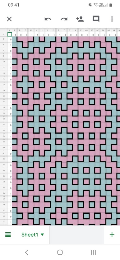
It took me a moment to realise what had been done here – every second row and column has been made narrow in order to create the black borders, and the cells are coloured accordingly in order to make the pattern.
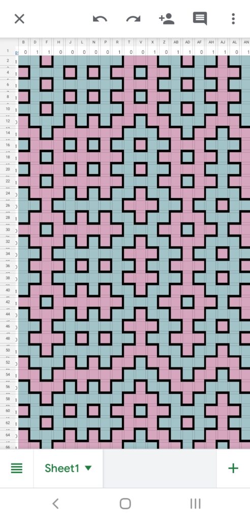
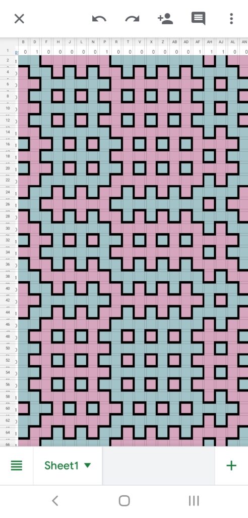
While it’s obviously a pretty picture, that’s not in itself impressive. But intriguingly, when I loaded the spreadsheet a second time, the 1s and 0s around the top and left changed (they’re generated by a =randbetween(0,1) formula, which recalculates itself when anything changes or the sheet is reloaded) and this then changed the layout of patterns on the sheet!
Each new combination of 1s and 0s produced a similar-looking but obviously different pattern of shapes. I was intrigued, and it took me a few minutes to work out what was going on. If you click on the three images above, you should be able to get an enlarged version to see the numbers and try to work out a theory. It’s surprisingly simple, and as a hint, the 1s and 0s correspond to the narrow cells, not the wide ones.
I went back to the original source of the spreadsheet (Andrew Stacey, who’s recently written posts for this site, had shared it with me through his school maths department’s Twitter account) to see where it came from.
The hashtag in the tweet, #MathArtChallenge, links it to Annie Perkins’ Math Art Challenge, which we mentioned in our ‘Things to do’ post back in July and Andrew Stacey’s last post Doughnuts in the Sand was also inspired by. It’s a collection of prompts to encourage you to create mathematical art, and this spreadsheet in particular was prompted by Day 14: Hitomezashi Stitching.
The principle is that each horizontal or vertical line of stitches alternates between above and below the fabric (or, between black and not-black in the spreadsheet), and given a set of 1s and 0s around the edge, the 1 and 0 specify whether the first stitch in that row is black/on top or not. Surprisingly, this simple set of rules gives rise to a gorgeous random-looking pattern – it took me a while to notice that each narrow row alternates between black and non-black! The resulting pattern can also always be 2-coloured.
Hitomezashi stitching is a form of sashiko, a type of traditional Japanese embroidery. Originally used for repairing fabric, it’s now more often used decoratively, and is usually based on a running stitch’ (one which just goes above and below the fabric without turning back on itself. It was proposed for #MathArtChallenge by Katherine Seaton (who you may remember was the winner of our Fractal Bunting Competition last month with her Fibonacci snowflakes – these arise in Hitomezashi stitching when the right pattern of 1s and 0s is employed around the outside).

Andrew’s spreadsheet is a lovely implementation of the Hitomezashi stitching technique (‘if you don’t want to stitch it on a bedsheet, stitch it on a spreadsheet’ – advice for life) and uses conditional formatting, with the 1s and 0s combined to give entries in the cells to implement the colouring rules. The screenshot below has the cell text visible, but in the real spreadsheet it’s the same colour as the cell.
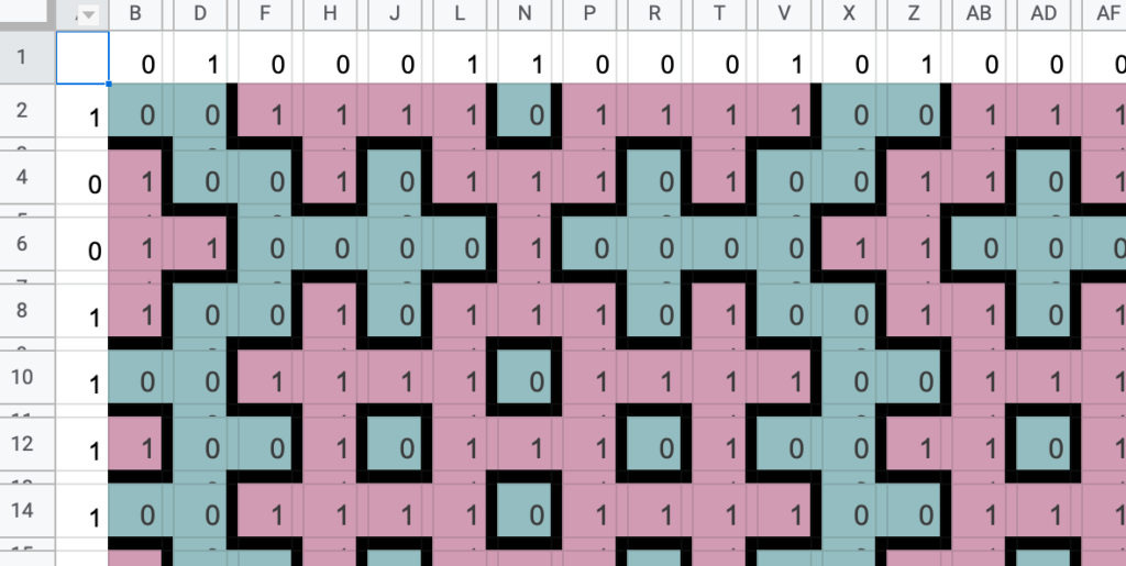
Cells taking the value 1 are coloured one colour, 0 the other, and anything that takes the value 0.5 is coloured black. You might enjoy trying to work out the formula to generate this – if you think you’ve got it, you can make a copy of the spreadsheet in your own Google Drive and see if you’re right.
Further reading
A Two-dimensional Introduction to Sashiko, a conference paper for Bridges Math Art conference by Katherine Seaton and Carol Hayes, on the ArXiV
