It’s daylight outside at the moment, which hasn’t been the case for pretty much any of the past few months up here in the North-East of England. That means Spring is on its way, so my cleaning and tidying instinct has activated.

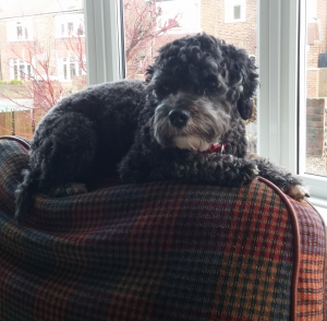
When I can’t think of anything else to put here, I’ll use a picture of Poppy, the Aperiodical Dog.
We’ve had the same layout here since 2013, I think, so it was high time it was freshened up. I’ve made a bright new header image, and I’ve banished the sidebar to the bottom of the page so there’s nothing to interrupt your reading of our very interesting articles.
Additionally, we’re always finding that we want to add extra bits of information or quips, with nowhere sensible to put them. Parenthetical statements ruin the flow of reading if they’re too long, and footnotes don’t really work on the web. You’ll have noticed there’s quite a bit of space on the right (unless you’re reading this on your phone) – that’s set aside so we can put whatever little notes, links, or images we think would be worthwhile, without getting in the way of the main text.
So, I hope you like it, and please let us know if anything’s broken in the comments.
The Aperiodog, surely ;-)