Since we’d like to write a funny post about it, if you’ve been sent any literature for the upcoming local elections in the UK (or indeed, from the past or from other elections around the world) which contains a graph or chart of questionable rigor, we want to know about it.
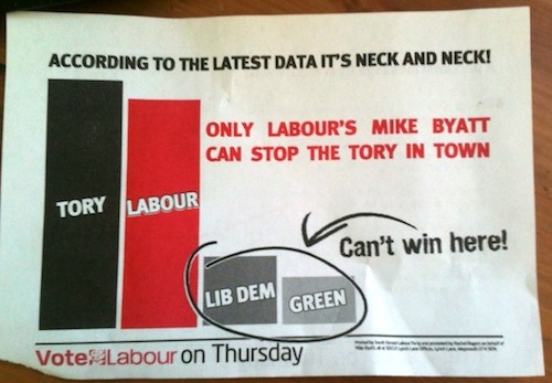
As an example, Colin Beveridge sent us this classic from his doormat:
We’ll be awarding bonus points for inaccurate pie charts, exaggerated/meaningless bar sizes, the complete absence of axis label or scale, the use of ‘Can’t win here!’ and any other sneaky/incompetent features. Email your submissions to root@aperiodical.com, and watch out for a roundup post if we collect a sizeable pile.
