Anna Haensch and Annie Rorem are the hosts of a new podcast, The Other Half. This post is based on the first episode, about racism and segregation.
In episode one of The Other Half, we look to mathematics as a potential tool for understanding racism and segregation in our society. To get a sense of the extent of segregation in the United States, we turn to a beautiful, startling tool to visualize it. Literally.
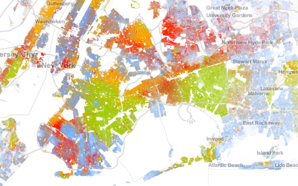
The Racial Dot Map was created in 2013 by Dustin Cable who, at that time, was Senior Policy Associate at University of Virginia’s Weldon Cooper Center for Public Service–and a
co-worker of Annie’s. This map looks like a pointillist interpretation of the physical United States, with red, blue, green, brown, and orange dots scattered within the boundaries of the country. Each of these dots represents a person, which means that there are 308, 745, 538 dots on the map. The dots’ colors correspond to each person’s race or ethnicity, as identified on the 2010 census.
At first blush, the map is a giant swirl of colors, apparently bleeding into one another. From a distance, though the map looks largely blue–which, we learn from the legend, is the color representing White–there are clearly areas where many colors exist, apparently side by side. However, pick nearly any part of the map and zoom down the closest possible view; you’ll see a color-blocked pattern, where similarly-colored dots cover entire blocks. Frequently, these blocks are separated by a seemingly invisible line from blocks populated by dots of an entirely different color.
Except, thanks to this stunning visualization, that line is no longer invisible. The map does more than any chart, graph, or verbal description to show that in areas all over the country, from Chicago to Baltimore to LA, people are living in neighborhoods segregated by race or ethnicity.
As we explore this visualization, we get Cable on the line to tell us what compelled him to create it and what he thinks we can learn from it. We check out particular areas, are startled by the presence of “little green boxes,” and ask the question, “Why, exactly, do we see such stark segregation in so many places across this country?”
The Other Half, a new podcast from ACMEScience.com, is an exploration of the the other half of a bunch of things. First, Anna and Annie want to take you on a tour of the other half of math — the fun half you might be missing when you learn math in school, the half that helps you makes sense of your own life. And on the flip side of that equation, they want to explore the other half of life — the half of day to day social scenarios that can be better understood by thinking about them like a mathematician. Lastly, Anna and Annie — as women of science — represent the other half of people. More than half of the humans on earth are female, but that parity isn’t reflected in the world of math and science. They hope to lend some much needed lady voices to the conversation. Listen in at theotherhalf.acmescience.com.
One Response to “The Racial Dot Map”