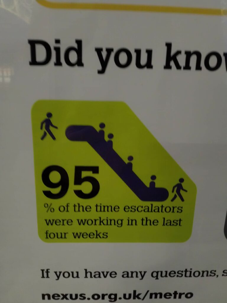
Earlier this year, when getting the train to work was still a thing for me, I noticed this statistic:
The reliability of the Tyne and Wear Metro is a contentious topic, running on a knackered 40-year-old infrastructure that seems to always be breaking down. To show that they’re taking the matter seriously and not deliberately running everything into the ground, Nexus, the organisation that runs the service, puts up these monthly infographics showing statistics about how well things are going. Normally, things aren’t going well.
I don’t hold that against them: they’ve got a hard job, and they’re doing their best with very little money compared to the South.
So this stat caught my eye primarily because it was so high. It also caught my eye because at the time, one of the escalators at Haymarket, where I get off for work, had been out of action for weeks, and would remain so until lockdown began at the end of March. (As far as I know, it’s still broken. I haven’t been on the Metro since then.)
Is this statistic misleading, or is it a fair reflection of reality?
It’s not completely clear what the statistic means, and there’s no space on the poster to explain how it was measured. To give some context, the Metro system covers the cities of Newcastle and Sunderland and their environs. Some stations have no escalators, some stations have one in each direction, and some have several, as well as lifts.
To quote Mitch Hedberg, when an escalator stops working it becomes stairs, so while it’s annoying, it doesn’t make a station completely inaccessible, like a broken lift does for people who need one. So the stakes for this statistic are very low – exactly the kind of thing I enjoy overthinking.
I came up with a few candidates for what “escalators were working” might mean:
- Every installed escalator was working the whole time the network was running.
- Every station had a working escalator.
- They measured the time each escalator was running, and took the mean.
- The whole time the network was running, at least two escalators were working somewhere.
- At least two escalators were working somewhere, while the network was running.
Each of these can be justified. I think the one you pick depends on how ambitious you are about the running of the Metro – whether you’re a “carriage half-full” or a “carriage half-empty withdrawn from service, Metro apologises” kind of person.
I’ve prepared a table of reasons to use, and not to use, each statistic.
| Statistic | Use it because | But actually don’t use it because |
|---|---|---|
| Every installed escalator was working | All the escalators should be running all the time. | If one of the three escalators at Haymarket breaks and takes a month to fix, the statistic is 0% even though nobody was forced to take the stairs. |
| Every station had a working escalator | Everyone should expect to be able to use an escalator. | Most stations don’t have or need an escalator. |
| Measure the time each escalator was working, and take the mean | One escalator being broken all month doesn’t budge the statistic too much. | One escalator out of 20 being broken all month and every escalator randomly shutting off for three minutes each hour both produce a 95% statistic. One is much less convenient than the other. |
| At least two escalators were running somewhere | It’s a very low bar to clear. | If you get less than 100%, you might as well stop pretending you have escalators. |
While the cynical part of me would expect Metro to pick the statistic that paints them in the best light, it’s not at all clear that there is a best statistic. I like to believe that Nexus want to run the service properly, so they’ll pick a measure that incentivises them to improve things.
The problem is, it’s hard to say what the best choice is. This is a case of the enormous difficulty of telling the truth with statistics.
Can we derive a good statistic from first principles? Here are some aims:
- 100% should only be achieved when everything works exactly as it should.
- 0% should only be achieved when no escalators are working anywhere on the system.
- If we live good lives and keep hope in our hearts, the statistic will be a total ordering on the space of escalator wrongness: a stat of 95% is better for everyone than a stat of 75%.
That last one is where the difficulty arises. I’ll make a wild gesture with my arms right now and say it’s impossible.
You might want to think about an individual passenger’s experience of the Metro, and ask a question like “how probable is it that the escalators I want to use on my journey will be running?” This weights the availability of each escalator by the number of people you’d expect to use it at each moment in time. If an escalator breaks down at a quiet station, or at a quite time of day, that’s not as bad as all the escalators at Haymarket breaking down during rush hour.
One problem with this version is that I don’t think you can measure it directly: you’d have to do some statistical modelling of passengers. It’s also quite hard to explain, though that doesn’t seem to be a priority for Nexus.
In the end, I just emailed Nexus customer support to ask them how the statistic was calculated:
Hi,
I saw a poster in Monkseaton station with the following statistic: “95% of the time escalators were working in the last four weeks.” The wording is quite ambiguous.
Can you tell me how that was calculated, please?Christian
I immediately got this reply:
Thank you for contacting Metro. We aim to respond to 95% of emails within 5 full working days.
It’s 95% all the way down!
In the end, they got back to me 8 days later. I daren’t ask how that impacted their email response statistic.
I got a surprisingly detailed answer from an anonymous member of the Nexus Customer Services Team:
Thank you for your email.
Engineering have a system called SCADA which picks up signals from the escalators and lifts when they are stopped or started for whatever reason (e.g. emergency stop button pressed, stopped by engineering staff for maintenance, when they’re started up in the morning, etc.) All such “events” are logged in a database table.
We have a Qlikview dashboard which analyses these signals and counts the time between when each escalator was stopped and when it was restarted, to see how much of the time the escalator was “down” for.
The downtime is then compared with the time that the escalator should normally have been running. I think they exclude time when the station was closed and time when the escalator had been deliberately stopped by engineers to do maintenance that had been scheduled in. We’re interested in reliability of the escalators, how much time each escalator is down through malfunction.
If a station is open for 18 hours and an escalator is running for the whole time, it gets 100% for that day. If it stops through a malfunction at 9:00 and gets restarted at 13:30, it’ll get 75% for that day.
We total up all escalators for all stations over a 28 day period and give an overall percentage for how reliable out escalators have been in total.
The dashboard produces charts like the ones shown below for a single period. This shows that overall, our escalators were 98.3% reliable that month (on the top left chart where I’ve attempted to put in a yellow highlight). Looks like in this month there was one escalator at Haymarket that had issues for a day or so.
Kind Regards
Nexus Customer Services Team

So they’ve taken the “measure each escalator’s running time and report the average” approach. It’s the one I’d go for, if I had to actually implement it: it’s easy to calculate, and sits in between the two extremes of “are all escalators working?” and “is any escalator working?”
I’m honestly still not sure if this statistic is misleading.
I guess that a large reason Nexus started producing these infographics was to counter the widely-held view that the Metro is almost always broken – confirmation bias leads people to remember only the times their journey was delayed, and not all the times it ran punctually. But you can’t just shine the light of truth with statistics: a measure that seems too high won’t be trusted, especially if you don’t justify it. There isn’t a right answer.
Haymarket is one of the busiest Metro stations, so the broken escalator inconvenienced a large proportion of the ridership. Given that I saw a broken escalator every day for a month, “95% of the time escalators were working” seems straightforwardly incorrect. They could easily weight each escalator by its use, which they already measure.
It’s possible that the poster I saw related to the time before the Haymarket escalator was broken. I eagerly looked forward to February’s edition.
When it came, I was disappointed:
What a coincidental time to start reporting a different statistic!
This problem doesn’t just arise when you think about escalators. This summer’s alevelgorithm farrago showed that often there is no correct way to measure something, and the consequences can be life-changing.
I really should make some time to read How to Lie With Statistics. I’ve just found a set of slides by my colleague Malcolm Farrow which lay out the important points quite concisely.
I haven’t been near a Metro in nearly six months, but Nexus keep putting out those posters. The latest one is online, on their “customer satisfaction and performance” page. Almost all of the statistics have been replaced with reassuring words about their anti-Covid measures, leaving only “% of trains arriving on time (within 3 minutes later or 30 seconds earlier than scheduled)”, which is 84%. Is that good? It seems higher than I remember. It still means about 1 in 6 trains are late.
It’s all academic, anyway.
I’m not a fan of the ‘percentage of trains running on time’ statistic. It’s not a big deal for me if my train is 5 minutes late. I’m much more upset when it’s cancelled, or if there are no trains at all for three hours.
There should be a statistic that measures catastrophic failures (of the kind Northern Rail excel at).