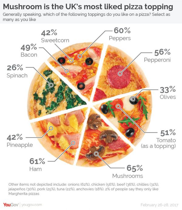
This tweet by YouGov appeared on my feed:
Forget pepperoni – mushroom is Britain's most liked pizza topping (65%), followed by onion (62%) and then ham (61%) https://t.co/5kYikXOEtF pic.twitter.com/AJezMfJHbk
— YouGov (@YouGov) March 6, 2017
Actually, for the purposes of criticism and comment, here’s a local copy of the image:
It should immediately set your data presentation colly wobbling.
- It’s not a pie chart: the slices are all the same size…
- … and some slices have more than one percentage linked to them.
- The percentages don’t add up to 100: each one is the proportion of respondents who liked that item.
- The percentages aren’t in order. You can’t immediately see which toppings were most popular, and which were least.
- In fact, several quite popular toppings were left off the graphic, and only mentioned in the small text underneath. Apparently anchovies (18%) are the least popular of the items listed, while onions are the second most popular.
But these are only problems if the point of the graphic is to convey useful information about people’s preferences for toppings, in a way that you can immediately apply. What else could it be for? If it’s just to give you a smattering of information about the results of their survey, maybe it’s not so bad?
It is.
The question asked respondents to tick any toppings that they like on a pizza. If you want to use this data, you might decide that a pizza with the three most popular toppings is sure to be a winner.
But the data don’t tell you two important things:
- How many people actively disliked each topping?
- Which toppings do people particularly like or dislike together?
The first point is even more subtle – each respondent has to decide on their threshold for saying they like a particular topping. Do they pick their three favourite toppings, or just any topping they wouldn’t object to having on a pizza? So “most liked” has a few different interpretations – does it mean ‘strongly liked by the most people’, or ‘disliked by the fewest people’? The first interpretation might pick a highly controversial topping, while the second is likely to return a very bland topping as the ‘most liked’.
Knowing which toppings people actively dislike would help to identify the most controversial items – for example, I reckon spinach (26% like) is much less controversial than olives (very similar, at 33% like), so the presence of olives on a pizza is much more likely to be a deal-breaker than spinach.
And knowing which toppings go well – or badly – together would also really help. Ham (61%) and pineapple (42%) is a classic combination, while I don’t think I’ve ever seen a mushroom (65%) and pineapple pizza on a menu.
So did YouGov capture any of this data, but leave it out because it’s not easily presented in a graphic that can spread on social media?
Not really. The full results of the survey are available from YouGov; there are a couple of questions about pineapple and whether it should go on a pizza, and a final question asking which ingredients the respondent would ban if they had the chance. If the answers to this question are ‘dislikes’, then you could define ‘controversiality’ to be ‘likes + dislikes’. By that measure, I was right to say olives (33+20 = 53) are more controversial than spinach (26+12 = 38), but you’re still missing a lot of complexity.
The phrasing of the last question, and the accompanying blog post, mention the president of Iceland, who recently said he’d like to ban pineapple on pizzas. So after all, this seems to be a stunt survey to get some fluff statistics which can be reproduced in news articles, with YouGov’s name attached. The context of the question somewhat explains the data collected – if you were the president of Iceland, which topping would you ban – but instead of presenting the toppings most Britons would like to ban, the graphic showed the topping the most Britons ‘like’. That might be because the most popular topping is not surprising – it’s anchovies, followed by olives – while I don’t think anyone would expect mushrooms to come first in a ranking of favourite toppings.
To finally return to the question of why this graphic was constructed the way it was, one clue might be the stock photo used, which shows some of the toppings mentioned in the survey. I tracked it down in iStockPhoto – the original is a collage of eight one-sixth slices of pizza with different toppings. It looks like the person who made the graphic has just arranged six of them in a circle, and picked out the ingredients mentioned in the survey. Note that the stock photo has a slice with prawns, but they don’t seem to have been mentioned in the survey at all!
Could prawns be the nation’s favourite pizza topping?

I think this is crying out for creating a proper pie chart based on a new survey of what percentage of people prefer a set of selected toppings, and then baking that pie chart as one pizza. Who’s up for that ?
Hell YEah John!
Hello there I am boba