The new live DVD from science comedy trio Festival of the Spoken Nerd, Just for Graphs, is out now, and we’ve been sent a copy to review. We got together a pile of appropriately nerdy science fans to watch (left), and here’s what we thought.

The new live DVD from science comedy trio Festival of the Spoken Nerd, Just for Graphs, is out now, and we’ve been sent a copy to review. We got together a pile of appropriately nerdy science fans to watch (left), and here’s what we thought.

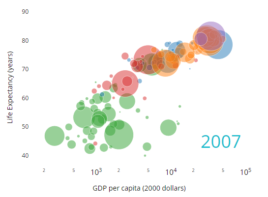
Plot.ly is a fairly comprehensive tool for creating whizzy interactive charts from data. It provides a suite of tools to make a whole range of different types of charts.
Until now, it’s been a web service you send data away to in order to get a chart back. I’d always been wary of that, because I worry about what happens when Plotly the company gets sold off or goes bust, and plot.ly the service gets shut down.
Well, now I can use a little bit of plot.ly, because they’ve released the bit of the chart-drawing code that runs in your browser under the MIT open source licence, meaning anyone can use it independently of Plotly’s servers.
With just the open-source stuff, the process of creating a chart is quite torturous because you have to define what you want by following a fairly illegible JSON schema. That means there’s still a reason to use the proprietary stuff that gives you a nice interface from Python or R, though I suppose people will soon enough start making their own versions of those that just tie into the Javascript stuff.