EDF Energy, one of the pantheon of Olympics sponsors, has opted to share its love for energy through its ‘Energy of the Nation’ project, launched earlier this week. By monitoring the nation’s positive and negative ‘energy’, by which they mean ‘things they are saying on Twitter’, they’ll turn the London Eye into a giant pie chart each evening at 9pm and display the results of the previous 24 hours’ sentiments over the course of 24 minutes. While my approval of such a large act of data representation is practically off the (pie) chart, I’m interested to find out how it works before judging it either way.
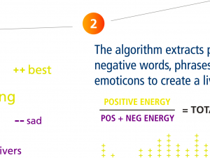
Their website has a page entitled ‘How It Works’ which, with many unnecessary infographics, explains that tweets containing references to the Olympics – containing words such as ‘olympics’, ‘torch relay’, ‘#energy2012’ and related terms – will then be analysed for how positive or negative they are. This mysterious process, inexplicably called ‘Sentistrength‘, will involve an analysis of positive and negative words, such as ‘brilliant’ (+3) and ‘failure’ (-4) (their scoring, not mine); modifiers such as ‘quite’ and ‘almost’, and crucially in this age of Twitter, punctuation: “Brilliant!!!” being obviously more positive than “Brilliant!”. The algorithm is also trained with “a large library of positive and negative emoticons” which can also be used to assess the mood of tweets. It assigns a separate positivity and negativity score to each statement (so something can be strongly both).
While this all seems very scientific, the page doesn’t say how it’s going to deal with the fact that in British English, “Brilliant.” in fact means someone is being sarcastic and doesn’t approve at all, or how it copes with words like ‘wicked’ or ‘bad’ (in the Michael Jackson sense); does it know the difference between something that’s ‘the balls’ or just ‘balls’- or indeed someone talking about the balls in play during sporting competition? On top of which, does the library of emoticons include the ones that look like knobs? I’m assuming they mean negative energy, but who knows.
The algorithm has been developed by researchers from the University of Wolverhampton, who give a more detailed description, and an interactive sentiment assessment device, here. One of the researchers, Mike Thelwall, gave an IMA branch talk on the subject last year; his slides can be seen here. While the researchers acknowledge the issues described above, and that any approach to this problem will be somewhat primitive, it’s still interesting that we might be able to have a tool to analyse the mountains of not-so-quantifiable data provided by social networking and comments threads, which must surely now make up a significant fraction of information on the internet.
Of course on the EDF website, this is represented by a photo of two earnest people pointing at the multicoloured background which is full of keywords and pluses. The website contains a ‘Live Data’ page which has infographics displaying the current ‘Energy Level’ (at time of writing 62%, but to be fair the Olympics haven’t actually started yet) as well as commonly used keywords and a graph of the tweet volume and corresponding energy level over the last 24 hours. There’s also an interactive map.
If this gets people interested in data representation or pie charts, that will be excellent. Given the internet’s ability to thwart even the best-intentioned of online surveys, I’d imagine at some point something amusing might happen. Hopefully it’ll be funnier than the Telegraph’s observation that the phrase ‘totes amazeballs’ is in the dictionary of positive terms.
Sources:
EDF Energy – Energy of the Nation homepage
Olympics Tweets will decide colour of London Eye (Londonist)
Happy Olympic tweeters to light up London Eye (The Telegraph)
Mike Thelwall’s homepage
Sentistrength
Slideshare – Mike Thelwall: Sentiment Strength detection for the social web
