Welcome to The Big Internet Math-Off! Over the next month, 16 intrepid mathematicians are going to be sharing some of their favourite bits of maths in a series of head-to-head matches that will leave all of us mathematically enriched and all but one of them wishing they’d read more Martin Gardner.
The tournament starts today with our first match in group 1: Alex Corner vs Lucy Rycroft-Smith. They’ve each made a pitch for a fun bit of maths, which is below, and at the end of this post there’s a poll where you can vote for your favourite bit of maths.
If you know any more cool facts about either of the topics presented here, please write a comment below!
So, without further ado, let’s once more toot Gabriel’s Horn and start The Big Internet Math-Off for 2019! First up is Alex Corner.
Alex Corner – Coya’s Law: A Curious Operation

Alex Corner is a lecturer at Sheffield Hallam University interested in category theory and maths education. You can find him as Fabstract Nonsense on Twitter at @alexcorner.
With interesting bits of mathematics, I find that I often come across them on Twitter, as I’m sure many of the readers of this blog also do. Many of these things, including the following, come from John Baez.
Coya’s Law:
\[ x^{\ln y} = y^{\ln x} \]
In fact, if we let $x \operatorname{\#} y = x^{\ln y}$, three laws hold:
from a tweet by John Baez
- the commutative law: $x \operatorname{\#} y = y \operatorname{\#} x$
- the associative law: $(x \operatorname{\#} y) \operatorname{\#} z = x \operatorname{\#} (y \operatorname{\#} z)$
- the unit law: $e \operatorname{\#} x = x$
To me it looks so simple but oddly unintuitive! The fun lies in proving all of the laws shown in the tweet above. For an extra challenge, try and show that every positive real number, except one special case, has an inverse. That is, if I give you an $x$, can you give me some other number $y$ such that $x \operatorname{\#} y = e$?
Lucy Rycroft-Smith – Wet bias

Lucy Rycroft-Smith is a researcher and writer at Cambridge Maths. She was a maths teacher for ten years across primary, secondary and HE and is the co-editor of Flip the System UK: A Teachers’ Manifesto. She’s @honeypisquared on Twitter.
Did you check the weather today?
Did you use an app, or watch the news last night or this morning, or consult a website?
What information were you looking for, and how was it given?
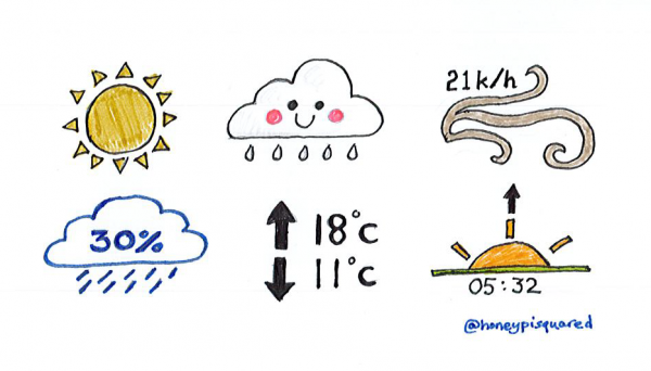
Weather info is really quite mathematical, but often benign-looking. Despite encoding some quite complex data at times, most of us (Including very young children) are able to interpret weather icons and their accompanying numbers with ease, even those who may otherwise have a stormy (pun very much intended) relationship with maths. That’s because they are usually really, really well designed. Try the images below on a mathphobe, or a small child, and see how much info they can happily tell you from each one.
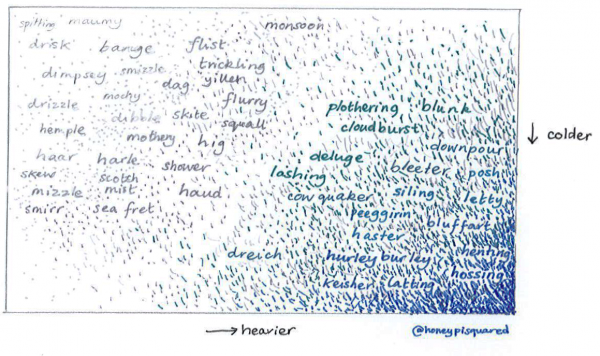
We humans, with our silly thin skins and our inadequate levels of hirsuteness, are particularly obsessed with wet stuff coming out of the sky. Some have stated, perhaps with due cause, that in the British Isles we have something of a fixation on rain. We certainly do have some most beautiful words for precipitation; have you heard of dringey or dibble, haar or haster, flist, drisk, dag and hig?
For many years now you’d be as like to find folk staring down at their screen as staring up at the sky, grumbling and squinting at numbers and symbols instead of decoding clouding. We are less likely to be found cloudspotting and more likely to be found crowdstopping, slowing, weaving and wandering along the pavements as we wonder whether the weather will tether us to desks at lunchtime or release us to make peace with the erratic outdoors and run our errands without risk of seasonal errhines (the myth of influenza may not be such a myth after all). The weather has influence. It can make our very dispositions sunny or stormy, our day bright or overcast with gloom. We can be under the weather in many senses (originally a naval term, under the weather rail was the place on a ship where one went to – somewhat ironically – escape the weather and get some rest). No one, no matter how rich or powerful, can change the weather (not strictly true, of course). It is a great universal leveller, being damp.
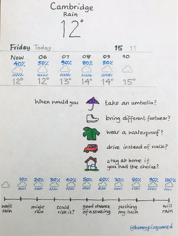
Often, the most pertinent information available on rainfall is now given to us as an hourly percentage. My Lucy’s-eye-view of the day usually looks something like this – my iphone’s default weather app is powered by The Weather Channel, a US company owned by IBM; more on that in a moment. It’s a cool little chart of probability percentages, by hour.
Where’s the threshold, for you, for changing your behaviour?
What percentage likelihood of rainfall (and over how long) might prompt you to bring an umbrella?
Depends on the journey and the activity, of course – a three-mile walk demands more pause than a quick dash to the car; even a short hop to a cocktail party merits more attention than an amble to the post office (moist, as far as I know, has never yet been the new black). Similarly, whether to wear waterproof shoes or bring a coat relies on a multi-dimensional complex analysis of my daily calendar, but it almost always in the final reckoning comes down to this important statistic: what’s the likelihood of rainfall today?
Well, first of all we have to consider the fact that the percentages are broken down by hour. Maybe the morning looks fine, but there’s an 80% chance (it felt weird writing ‘an’ then. But I’m standing by it) of rain from 2-3pm. If so, what does that actually mean? That there’s a high chance of rain at some point during that hour across the whole area I’m looking at? (Right now, it’s Cambridge, which is pretty big – about 40 square kilometres at the very least, which would take a gentle jogger around 5 hours to run entirely around the outside of, without wees or ice-cream breaks. Which almost never happens).
Actually, it’s a simple multiplication between the chance of rain – in the biz, called PoP or probability of precipitation – and the area covered. The forecasters get a number on how confident they are that rain will happen somewhere in the area (presumably at any time during the time given), and another number on how much of the area they think will get that rain if it happens, and they times ‘em together. It’s like an average across the area.
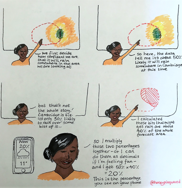
This means they may already be– from our little human view, at least – overestimating the rain, because we are unlikely to be out for that all-around- jog of our local area every day, unless a particularly kean-o Keanu. Weird, isn’t it? But it gets weirder.
‘Tell me about wet bias!’ I hear you say. (Actually, I’m not sure that’s ever happened).
But I will. Wet bias is really cool. When you look at a graph of forecast vs actual rainfall for the Weather Channel, there are some noticeable bulgy bits. Suspiciously biasy-looking bulgy bits. Let’s squeeze ‘em and see if we can get the bias out, shall we?
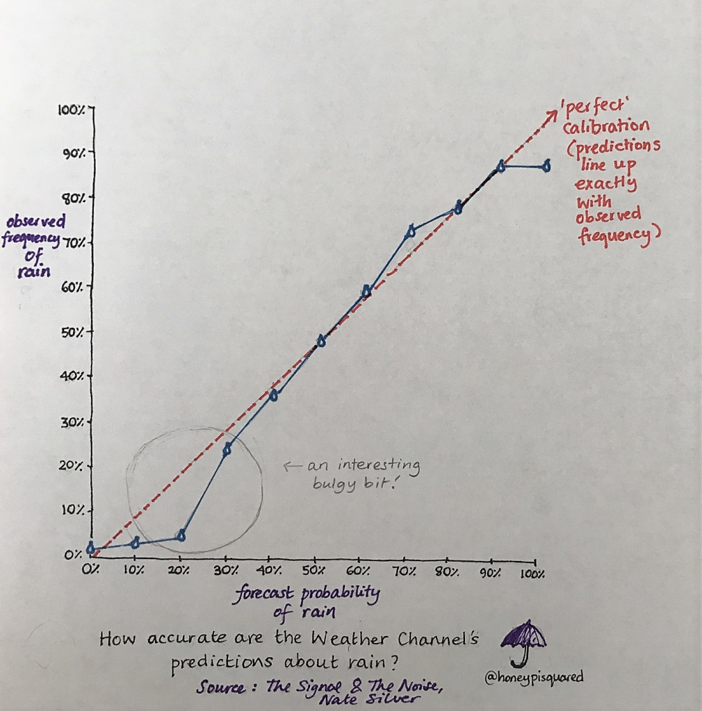
In the case of low chance of rain, you can see a big wet juicy lump (yum) on the bottom left of the graph. This means if the forecaster says there’s a 10 or 20% chance of rain, actually more often than not it’s only raining about 5% of time in that area. Why are they so inaccurate? Well, if we look at the rest of the graph, the lines are much closer – nearly on top of one another- in the middle. This suggest they can be very accurate with their predictions. Is it something specific to this low chance that’s the problem? Well, the lines pretty much meet up again at zero, which tells us that when the forecasters say rain isn’t going to happen, it almost always doesn’t. So this big lump might indicate something else – and it’s intriguing. In fact, The Weather Channel openly admits to a ‘wet bias’ when predicting around these small probabilities, because people REALLY notice it if you say there’s a really small chance of rain and they still get wet.
If the lump was curving up, on the top of the diagonal line, that would be the opposite: that the forecaster downplayed the chance of rain, which seems silly. If you overestimate the chance of rain and it’s not wet, hurrah! No bother. If you underestimate the chance of rain and people get soaked, they get pissed off in the pissing down weather. Nate Silver calls this ‘covering their butts in case of an unexpected sprinkle.’ There’s also some cool stuff going on in the middle and at the top end of the graph, too –you can read more about it in this article by J. Eric Bickel and Seong Dae Kim. Different weather forecasting services seem to have different signatures of wet (or occasionally – and intriguingly – dry) biases, depending on how local they are.
Wet bias is there because people are inconvenienced by rain to the point where they remember it. And even though I’m getting my forecast from my phone instead of a friendly face, it still gets under my skin when my skin gets splashy and I like to blame someone when I’m unprepared with a brolly.
To put it another way, wet bias exists because wet grudges exist.
The mathematical science of prediction is often importantly creative, because humans are interesting. Sometimes, there might be more significant issues to consider than just ‘being right’.
So, which bit of maths has tickled your fancy the most? Vote now!
Match 1: Group 1 - Alex Corner vs Lucy Rycroft-Smith
- Lucy Rycroft-Smith with wet bias
- (81%, 216 Votes)
- Alex Corner with Coya's law
- (19%, 52 Votes)
Total Voters: 268
This poll is closed.
The poll closes at 9am BST on the 2nd. Whoever wins the most votes will win the match, and once the group matches are all done, the number of wins will determine who goes through to the semi-final.
Come back tomorrow for our second match of the group stages, pitting Marianne Freiberger and Rachel Thomas against Vincent Pantaloni. Or check out the announcement post for your follow-along wall chart!
BBC Radio’s “More or Less” covered rain forecasting here https://www.bbc.co.uk/programmes/b0b3fz4c